Lenwich App
Bringing NYC’s Favorite Deli to Your Fingertips
Context: Case Study
My high level goal was to understand users’ behaviors to design an app for Lenwich and improve the user experience from the current website that is not mobile friendly and does not provide a seamless experience for users placing online orders for delivery/pickup.
Scope: Concept Project
Duration: Three weeks
Tools: Figma
Role: Research, Concept, Wireframes, Prototype
Team Members: Solo Project
The Problem:
Users need an app that is easy to use and can trust to receive what they order. Users are frustrated with ordering food online when it is difficult to navigate the platform and order exactly what they want, when restaurants get their orders wrong, and when the timing of the order is inaccurate. Lenwich’s website overwhelms users with too many options, and does not allow them to place their order quickly and efficiently. Users have a hard time navigating the website on mobile, locating the items they want to order on the menu, and take too long to order with additional required steps through the process.

Overwhelmed by endless scrolling on menu and only able to see one item at a time: the user faces endless scrolling and options when they open the menu and have no sense of where they are within the menu. The pictures are so large on the phone that they are only able to see one menu item at a time and there is no way to search.
Opportunities for Improvement:
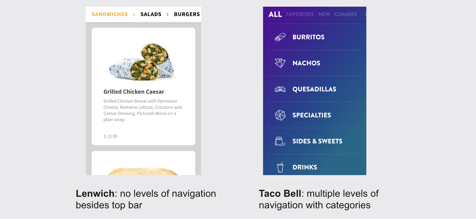
2. No levels of navigation on menu: users can slide top bar and go to different section of menu, but most users miss it and do not see this feature

3. Must re-enter credit card information every time: the website doesn’t give you option to save or use Apple Pay which is easiest for the user for a quick experience placing an order and is standard for most other apps/websites.

4. Build your own sandwich is not intuitive: the menu does not have a separate screen for building your own sandwich. Instead, it only starts with the base of the sandwich in alphabetical order, starting with avocado, meats, and cheeses. The user expects a cheese to be a topping on the sandwich, not the base option that they choose when building their own sandwich.
5. No way to customize order: users are not able to add any notes to their order if they want something in particular or if they, for example, want dressing on the side or bacon extra crispy. This is an important feature for many users who want the option to customize or specify something about their order.

6. No Order Again feature: many other apps prominently show pasts orders they have placed so they can quickly add it to their cart and make the process easier. Many users tend to order the same things at restaurants and it makes for a much simpler process. Lenwich does not offer this feature, while all other competitors analyzed offered this.

Lenwich needs a streamlined app that lets users place their order quickly and easily
After completing all research and usability tests with the current experience, I can finalize how my solution will help users with an easy and efficient way to order food online.
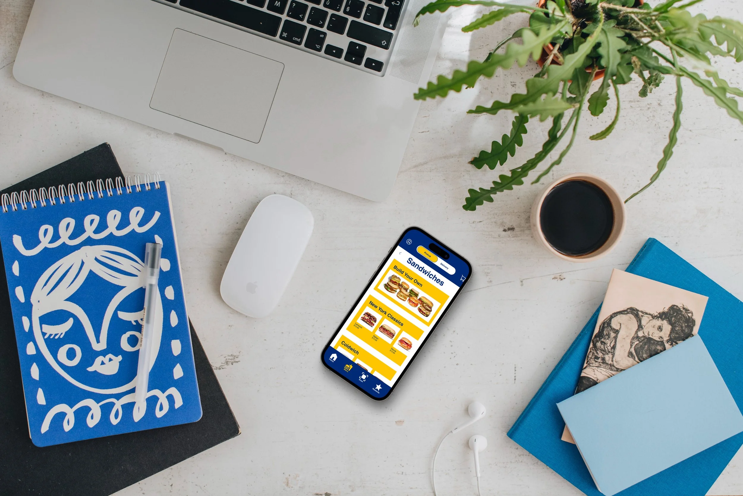
Using Lenwich’s new iOS app, users can quickly order food for pickup or delivery through improved navigation and information architecture, reduced clicks and information required to place an order, and re-structured user journey.
Wireframing & Testing:
Starting with Low-Fidelity Usability Testing & Insights
I completed the first round of usability testing with three users with the low fidelity wireframes to understand key areas that may be causing confusion or that aren’t intuitive before I spent more time adding details. Key insights from usability testing helped me improve the prototype included:

Mid-Fidelity Usability Testing Insights & Final Changes
After making improvements to the low-fidelity prototype based on usability tests, I added additional details and completed another round of usability testing, which gave me the following insights to improve upon for my final prototype:

Final Prototype:
Next Steps:
Create a user flow for a new user and allow them to use guest checkout: the current website requires all customers to create an account and enter more required information than is necessary to place an order. During my usability testing with the current site, two of my users said that they would have exited the website and ordered from somewhere else when they saw the screen of all information required to create an account, which included setting up username, password and entering home address and billing address.
Talk to Lenwich about adding a rewards system: Lenwich currently does not have a rewards system, and I believe they are missing out on opportunities by not having this system in place. Many other apps have a rewards system that entices customers to keep coming back and helps differentiate themselves.
Build out updates on order after placed: although my user flow ended when the user places the order, I would build out the tracking your order and give users updates when their order is being made and when it is ready for pickup or so that they can track their driver if it is delivery.
Reflection
Importance of using a design system - Through this project, I created and used a design system with fonts, colors, buttons, and components. This was important to take the time and set everything up properly and helped streamline my process.
Power of market research and C&C Analysis - Conducting market research and competitive and comparative analysis was crucial to see best practices on the market and understand online experiences users are expecting with other competitors. Since Lenwich does not have an app to build off of, it was essential to be familiar with user’s expectations with food applications.